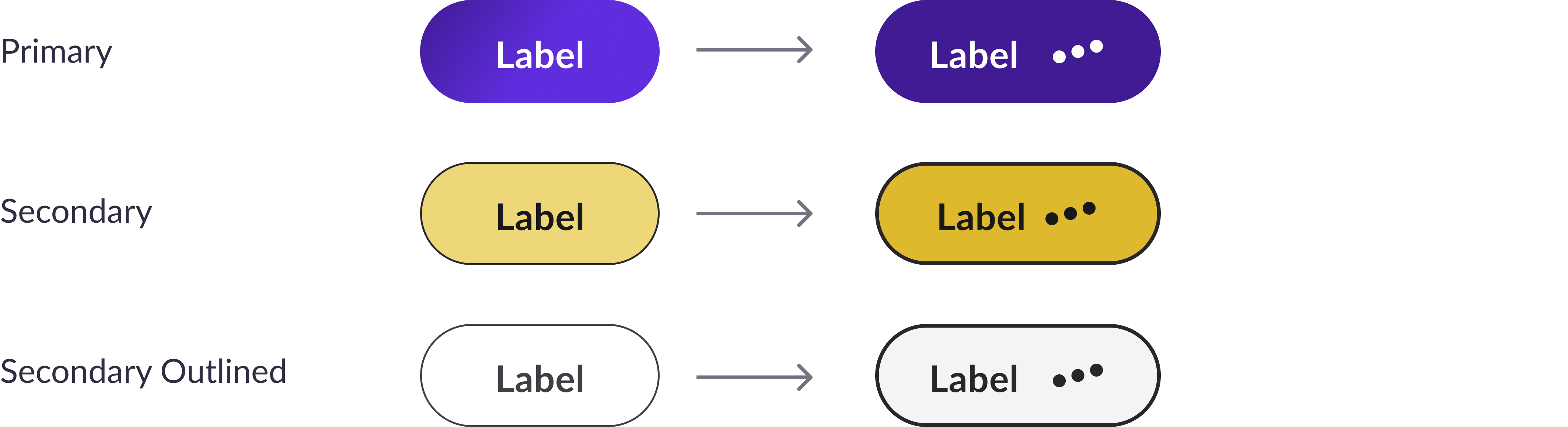
Standard buttons
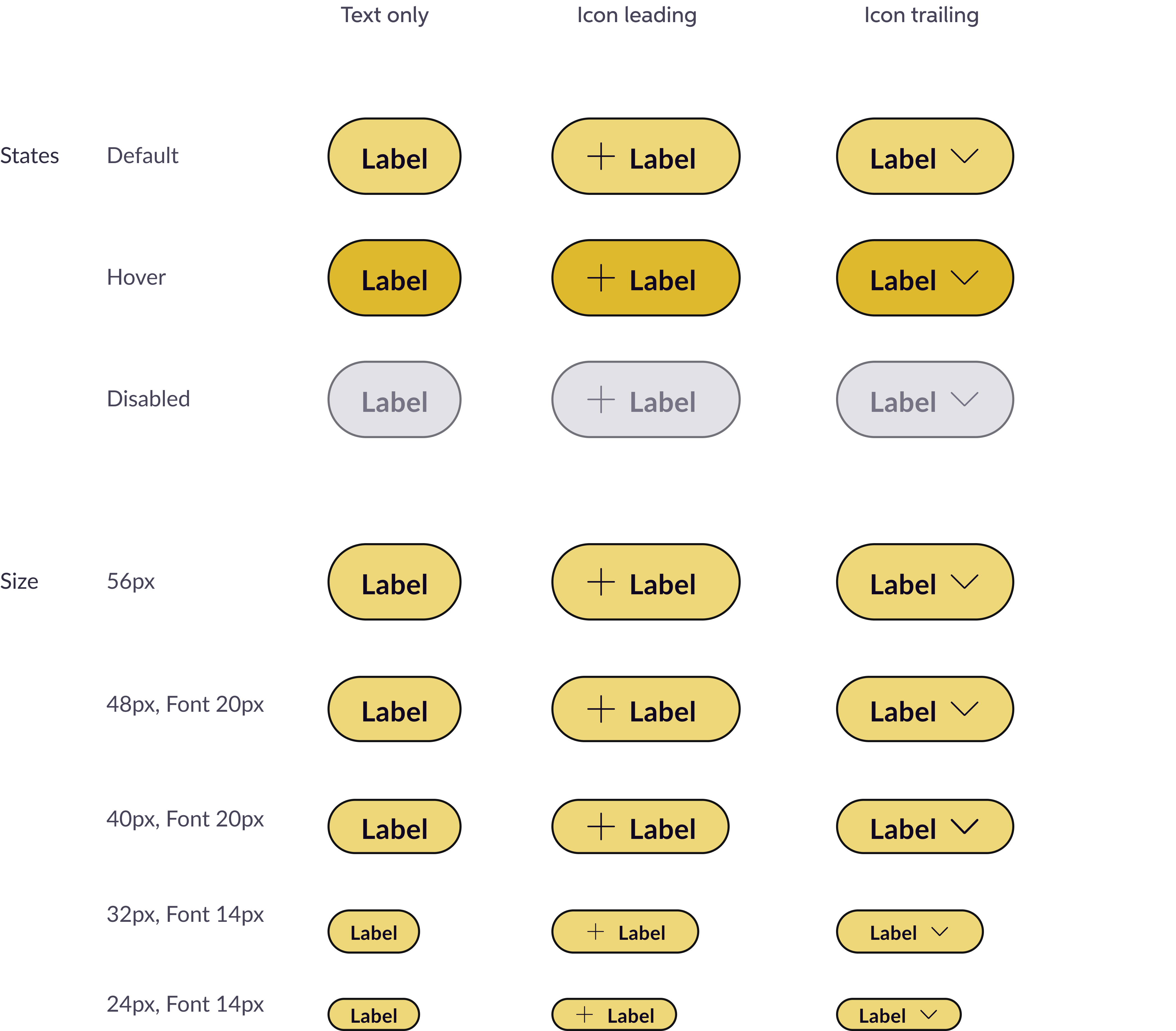
Secondary (=Primary Alternative)
High Emphasis (Filled)
Use primary alternative buttons when you need multiple CTAs on product pages. These typically use smaller sizes, while larger sizes work best for marketing pages.
We have a variant sizes for best experience. Also for best matching typography in product pages, the 48px buttons can use 20px font size as well as 16px
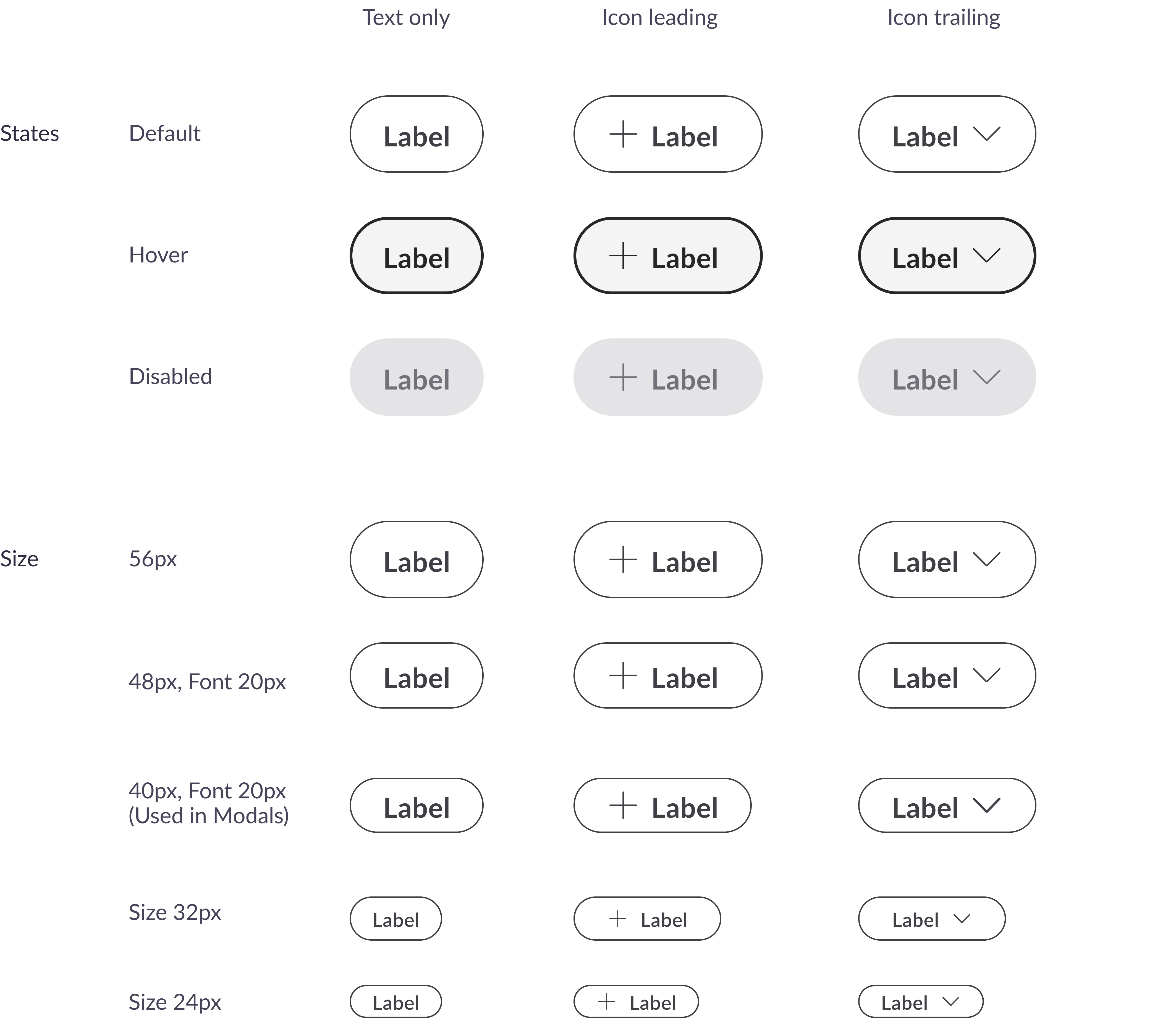
Secondary Outlined
Medium Emphasis (Outlined)
Use secondary buttons when you need multiple buttons on a product page or alongside a primary CTA button.
We use a variant sizes for best experience. Also for best matching typography in product pages, the 48px buttons can use 20px font size as well as 16px
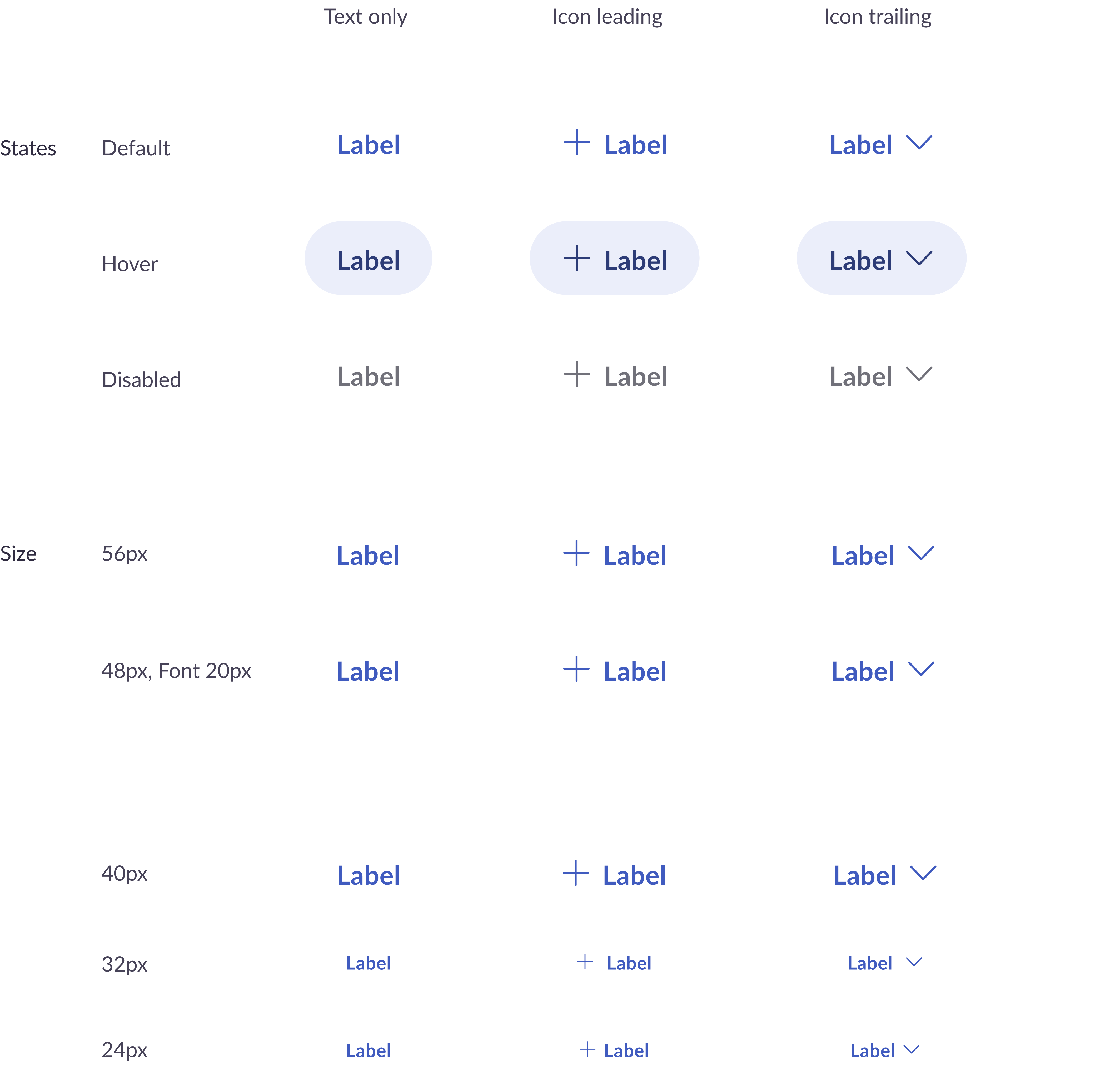
Text Buttons
Low Emphasis (Link)
Use tertiary buttons when you want a less prominent option on pages within the digital product.
We use a variant sizes for best experience. Also for best matching typography in product pages, the 48px buttons can use 20px font size as well as 16px
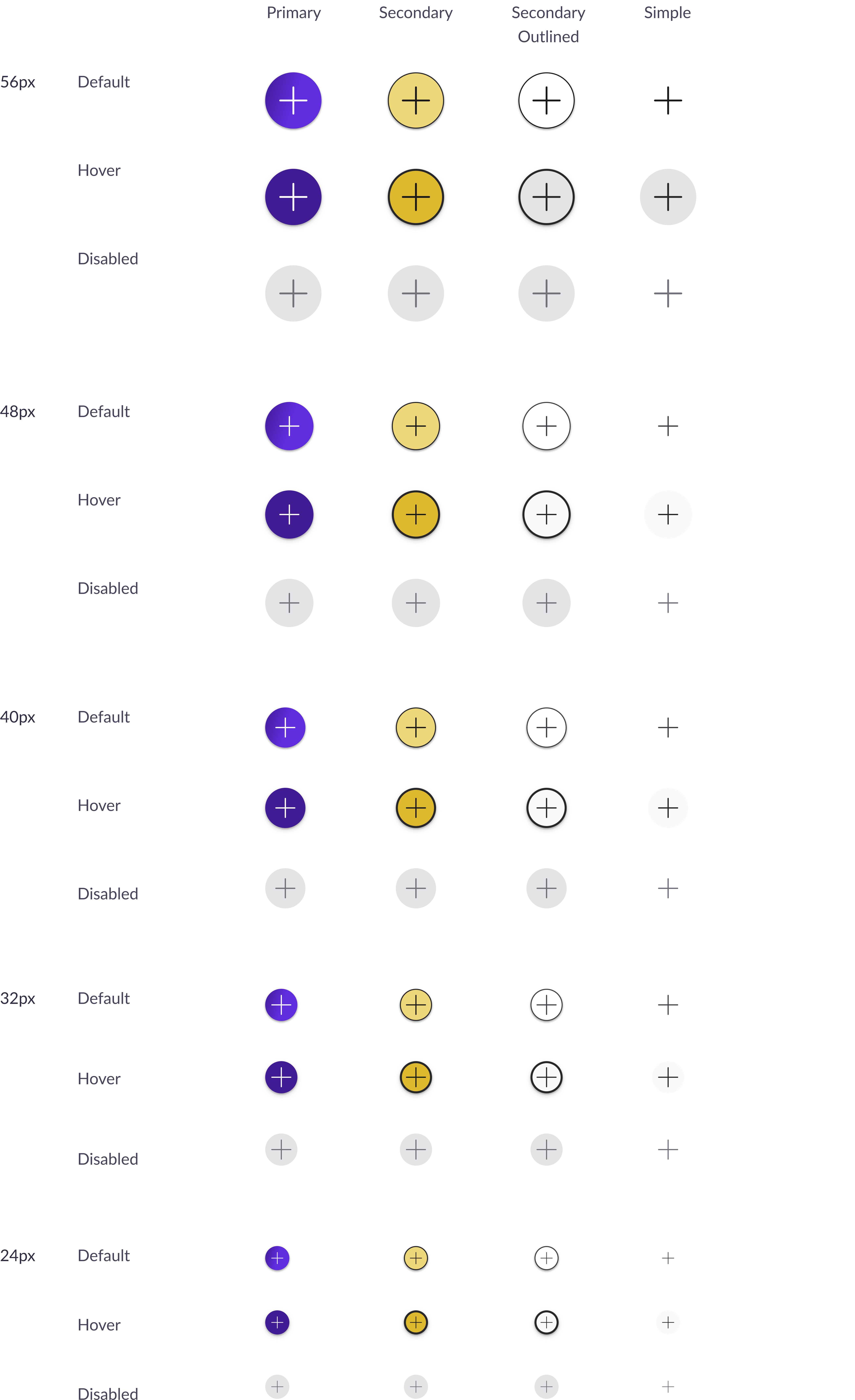
Icon Buttons
Low Emphasis
Use an icon button when an icon needs to be clickable.
They come in sizes from 16px to 56px and interaction states are included just like any other button.
“Saving…”, “Processing…” button
This button appears while an action is processing and cannot be clicked. It disappears once the action completes, after which the screen will update or close.
We use a variant sizes for best experience. Also for best matching typography in product pages, the 48px buttons can use 20px font size as well as 16px