
Usage guidelines
Buttons pairing
CTA with secondary
The CTA button should be placed on the far right.

Multiple options in page
When options are equally important, group them using secondary buttons. You can add tertiary buttons if needed.

Multiple CTA’s in page
When you need multiple CTAs, use a small primary alternative button with secondary buttons.

Spacing and padding
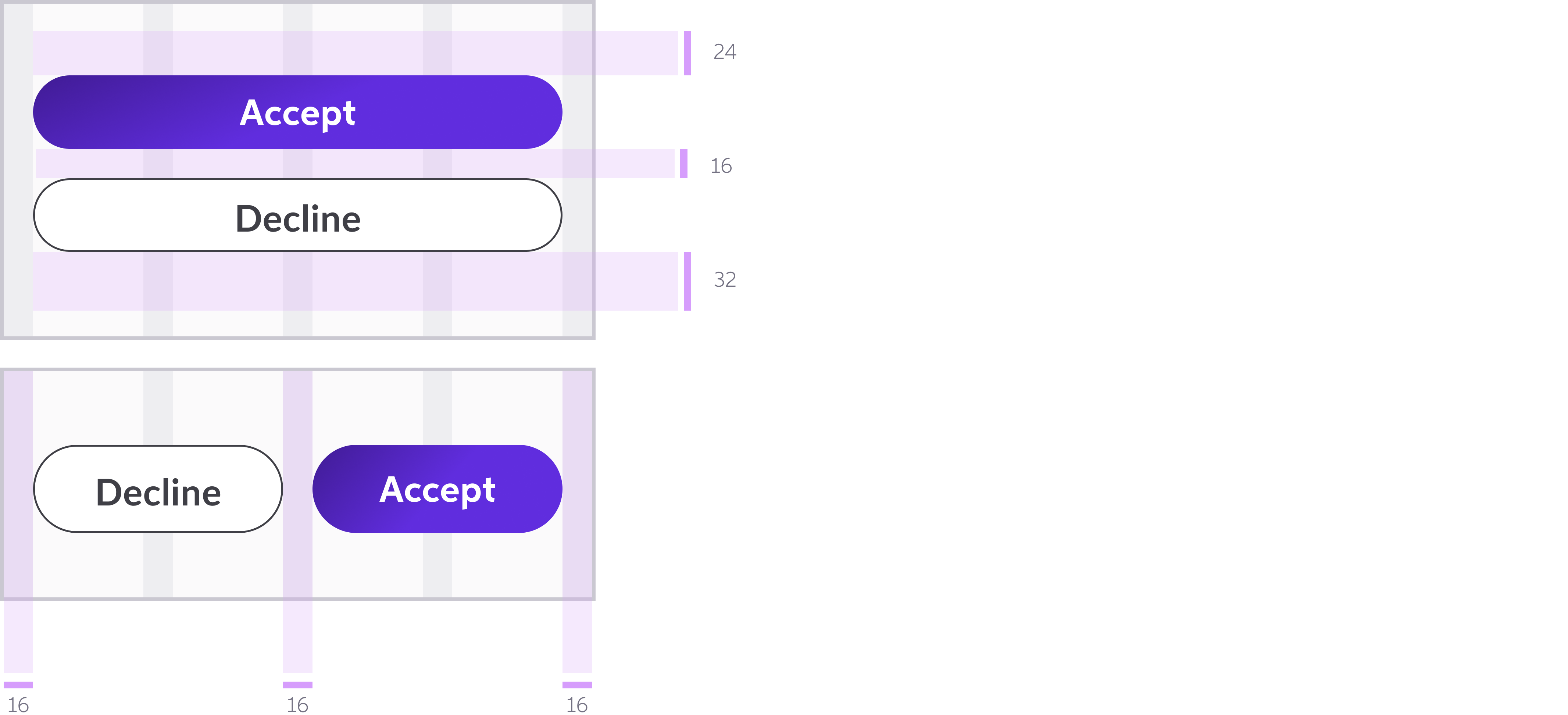
Space between button pairs
Button spacing rules:
- Keep 16px between paired buttons
- Keep 48px between CTA and other content
Note: Even upon hover, maintain at least 16px between the buttons

Top padding
Padding above buttons:
- 32px maximum
- Use 32px on desktop and large screens
- Use 24px on small screens and small space

Bottom padding
Padding below buttons:
- 32px minimum
- Use 48px on desktop and large screens
- Use 32px on small screens and small space
Action Button Best Practices
Primary Buttons with Icons
Button spacing rules:
- Keep 16px between paired buttons
- Keep 48px between CTA and other content
Note: Even upon hover, maintain at least 16px between the buttons
Don’t: Pair buttons that both have icons. Use only one action button (e.g. primary, secondary) with an icon at a time.

Don’t: Each button (e.g. primary, secondary) can have one icon, either on its left or right side.

Color Application
Padding above buttons:
- 32px maximum
- Use 32px on desktop and large screens
- Use 24px on small screens and small space
Do: Each button (e.g. primary, secondary) can have one icon, either on its left or right side.
