
🎨 Color
Primary colors
ĀYŌDÈ’s main color is purple - you’ll see it everywhere in our brand and platform. We use lots of white space to keep things clean and easy to read. When we need a pop of color, we add golden yellow alongside purple - they work together to make our brand look both lively and professional.
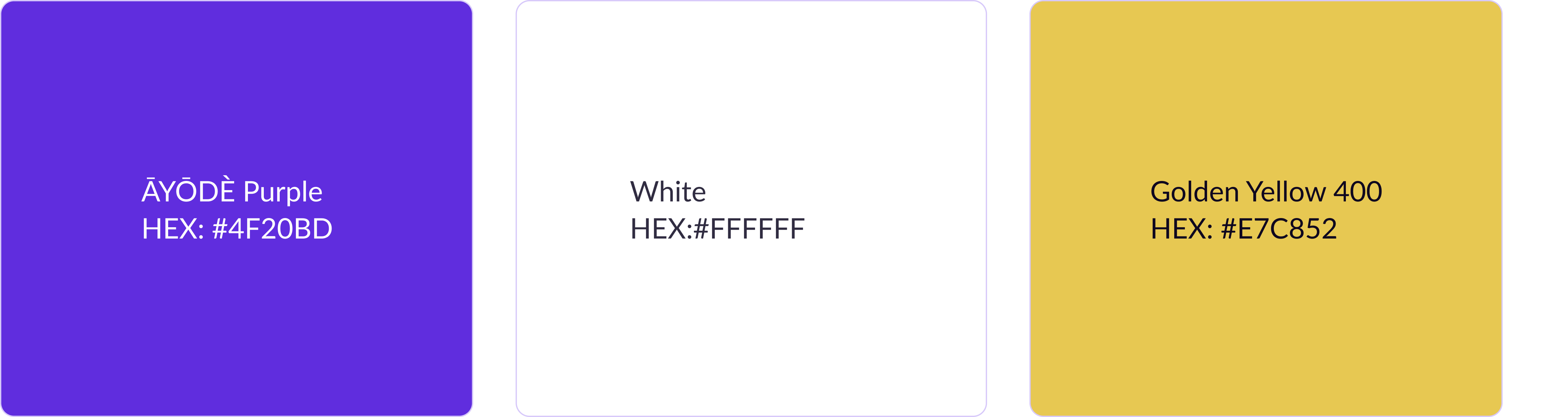
Accessibility Warning: Text and icons on color must meet the AA Color Contrast Accessibility standards. ĀYŌDÈ Purple text and icons may only appear on white. Only white icons or white type at 19 px bold or 24 px regular weight or larger can be used over ĀYŌDÈ Purple.
Main Palette
A white foundation with simple neutrals creates a low friction, high possibility foundation. Purple should feel like a core element throughout every design with the rest of our palette used sparingly.

.ayode-[text/bg/border]-primary
.ayode-[text/bg/border]-white
.ayode-[text/bg/border]-neutral-050
.ayode-[text/bg/border]-neutral-900
.ayode-[text/bg/border]-info-500
.ayode-[text/bg/border]-neutral-200
.ayode-[text/bg/border]-secondary-400Brand color and type combinations
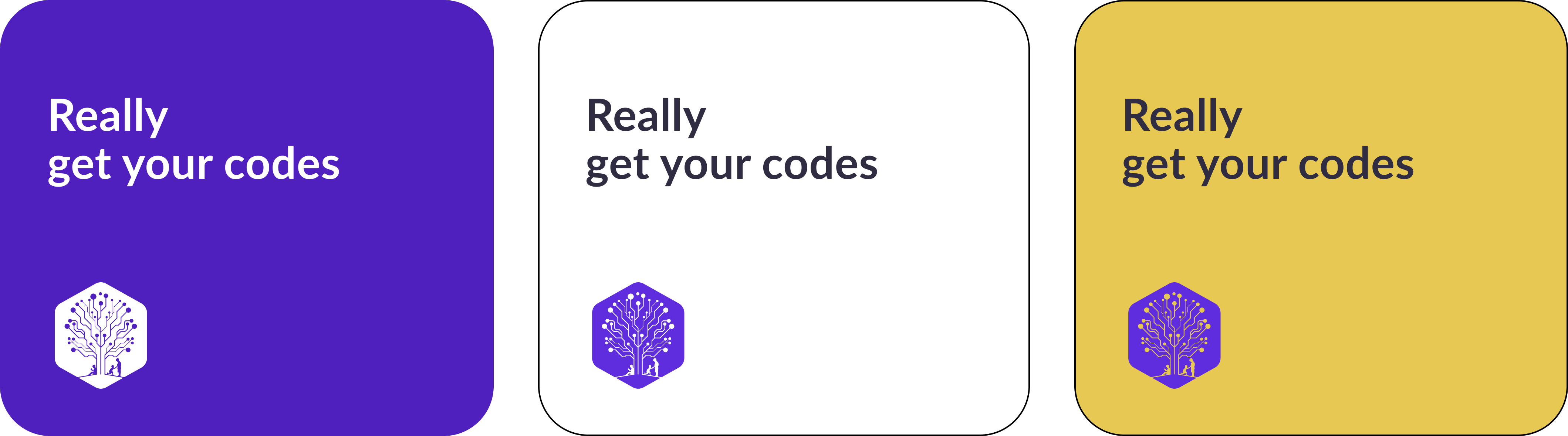
Avoid large body of white copy on purple.
Accessibility Warning: All type and color combinations must meet the AA Color Contrast Accessibility Standards. Always confirm color contrast before finalizing designs.
Color Reference –root-color (CSS)
- –ayode-primary →
#4F20BD
- –ayode-white →
#FFFFFF
- –ayode-bg-white →
#FBFAFB
- –ayode-black →
#1B1A17
- –ayode-link →
#6077CD
- –ayode-border →
#E4E4E7
- –ayode-highlight →