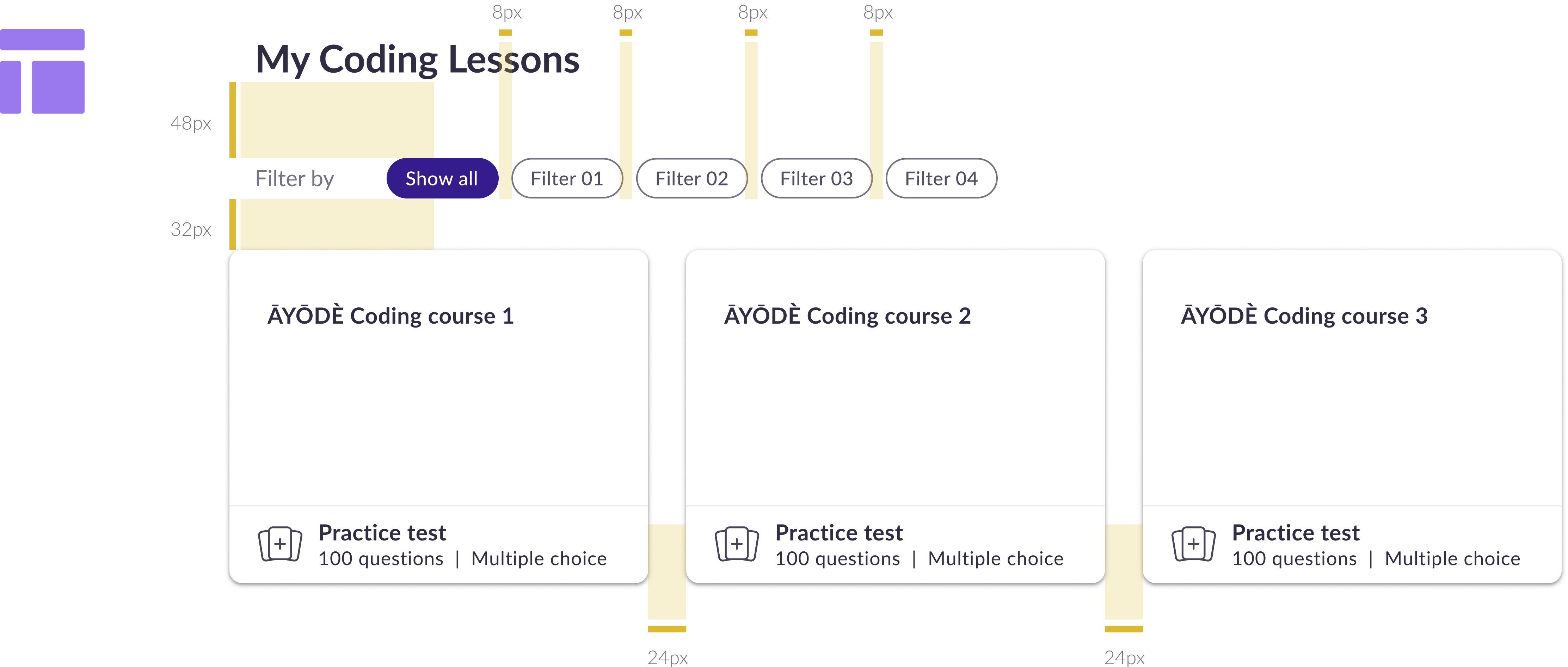
Spacing usage guidelines
Small values - 0px to 8px
Warning: For small and compact pieces of UI to create clearly connected elements in a larger pattern / component.
Examples:
- Gap between small icons and text Container padding of small components (ie badges, icon buttons, table cells)
- Gap between repeating elements (ie button groups)
- Padding within input components
- Vertical spacing between elements in a card (ie a title and description, a description and actions)
- Gap between the trigger and elevated element (ie between dropdown button & menu)

Medium values - 12px to 24px
Warning: For larger and less dense pieces of UI.
Example:
- Container padding of larger components (ie buttons)
- Space between avatar/large icon and content (ie section messages)
- Vertical spacing between elements in cards
- Spacing between items in less densely packed or larger components

Large values - 32px to 80px
Warning: For the largest pieces of UI and for layout elements.
Examples:
- The space between content on the page (ie spacing between top of page and header)
- Alignment within larger pieces of content